From data to explanations
Apply the workflow from Quick Start to one dataset, then read its performance plots and SHAP explanations. All figures below come from one IAML run; the complete script also saves a record of the analysis.
The question is concrete: can measurements in the breast cancer dataset bundled with scikit-learn distinguish malignant from benign samples? To keep the example small, we use 120 observations and six features: 90 observations for training and 30 held out for evaluation. Here, 1 means malignant and 0 means benign. The script reverses the original dataset labels to make that convention explicit.
Read the results
By default, IAML compares candidates using three-fold cross-validation, then fits the selected pipeline on the training observations. The illustrated run used five folds and selected a CatBoost classifier, with no additional feature transformation. The ROC AUC on the held-out observations is 0.967 in this run.
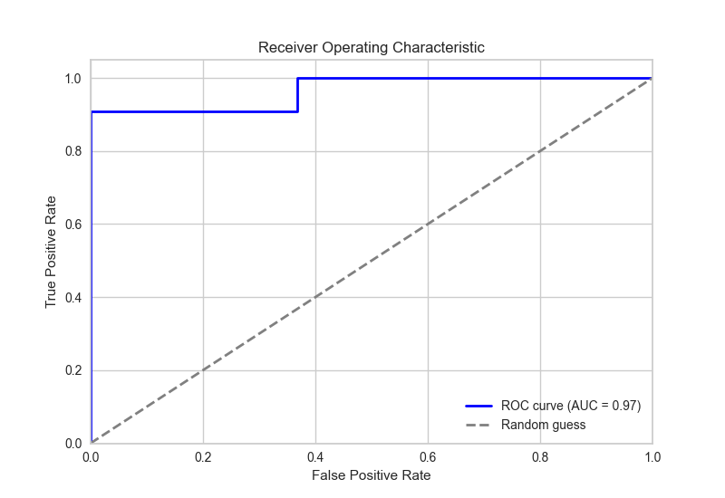
Discrimination on held-out data. The ROC curve shows sensitivity against the false-positive rate as the classification threshold changes.
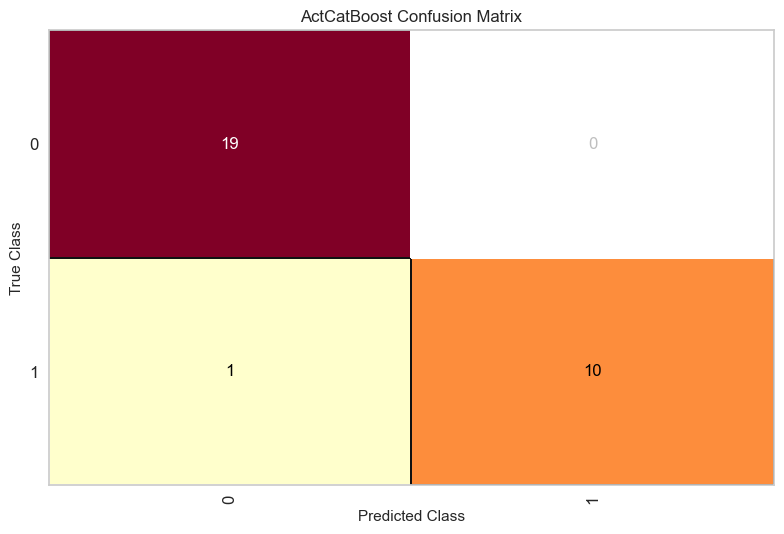
See the errors as well as the successes. The confusion matrix uses the classifier’s predicted labels. Read 0 as benign and 1 as malignant.
chosen_model.explain_model_performance(X_test, y_test) generates these
figures together with a precision–recall curve, classification report and
prediction-error plot. The script optimizes ROC AUC. ROC and precision–recall
curves accept decision scores or probabilities; the classifier in this
illustrated run also supplied probabilities for its SHAP explanations.
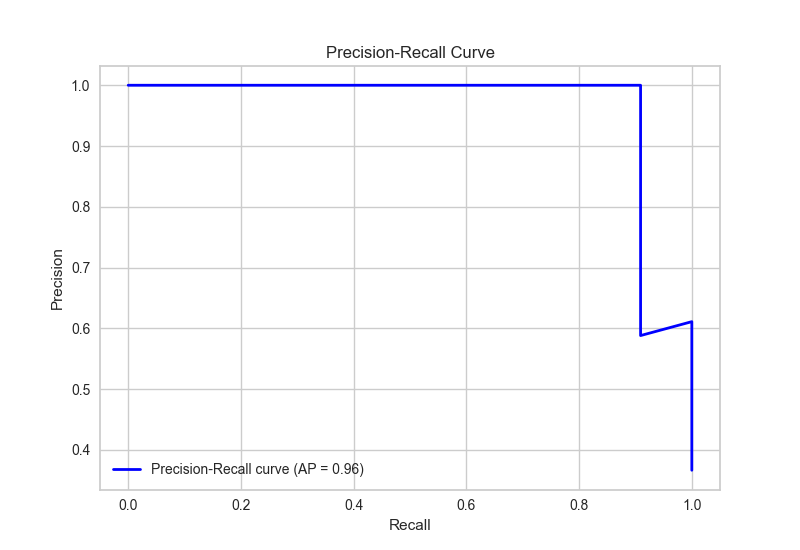
A complementary view. The precision–recall curve shows how precision and sensitivity change together as the probability threshold varies.
Understand a prediction
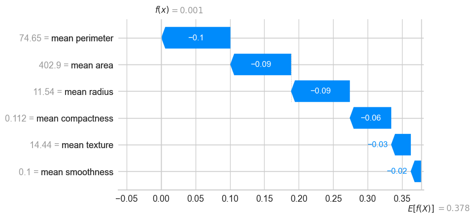
Why this prediction? Start at the model’s average output on its background
data, E[f(X)]. Each feature contribution moves it towards the explained
observation’s predicted probability, f(x). Red increases that probability,
while blue decreases it.
Here, SHAP explains the probability of class 1, malignant. The example computes contributions for just five held-out observations. A second figure summarizes the mean absolute contribution of each feature across those five rows:
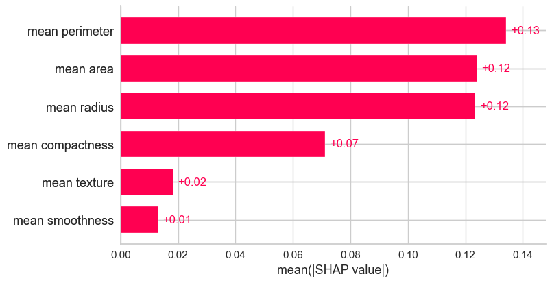
Which features contribute most in this small subset? Longer bars mean larger contributions, irrespective of their direction.
These are explanations of the model, not evidence that a feature causes the outcome. This small demonstration is not a clinical validation. Use a representative evaluation population and explanation sample for a study.
Run the complete example
Install IAML as shown in the Quick Start, save the code below as
clinical_workflow.py and run
python clinical_workflow.py. It uses only a bundled dataset, one worker and
a 30-second search budget. Final fitting and plotting add time. Search results
can differ between runs.
import json
import random
from pathlib import Path

import numpy as np
from sklearn.datasets import load_breast_cancer
from sklearn.model_selection import train_test_split

from iaml import IAML, RocAucMetric


def main():
    random.seed(42)
    np.random.seed(42)
    X, y = load_breast_cancer(return_X_y=True, as_frame=True)
    X = X.iloc[:, :6].sample(n=120, random_state=42)
    y = y.loc[X.index].eq(0).astype(int)  # 1 = malignant, 0 = benign.
    X_train, X_test, y_train, y_test = train_test_split(
        X, y, test_size=0.25, stratify=y, random_state=42
    )

    search = IAML(
        max_duration=30, max_workers=1,
        main_metric=RocAucMetric(), keep_training_history=True,
    )
    search.fit(X_train, y_train)
    chosen_model = search.chosen_candidate
    test_scores = chosen_model.evaluate(X_test, y_test)
    print(chosen_model.describe_steps())
    print(test_scores)

    output = Path("iaml_example")
    output.mkdir(exist_ok=True)
    for plot in chosen_model.explain_model_performance(X_test, y_test):
        (output / f"{type(plot).__name__}.png").write_bytes(plot.image)

    explanation = chosen_model.explain_feature_importance(X_test.iloc[:5], nsamples=64)
    for kind in ("bar", "waterfall"):
        (output / f"shap-{kind}.png").write_bytes(explanation.to_plot(kind).image)

    report = {
        "pipeline": chosen_model.pipeline_audit_summary(),
        "test_scores": test_scores,
        "training_history": search.training_history,
    }
    (output / "analysis.json").write_text(
        json.dumps(report, indent=2, allow_nan=False), encoding="utf-8"
    )


if __name__ == "__main__":
    main()
Running the script saves the figures as PNG files and the analysis summary as
JSON in iaml_example/ on your computer. The JSON records the configuration
and scores. It does not save the fitted model. See Study reporting for details
on recording an analysis.
To retrieve the method references, use print(chosen_model.bibliography())
after fitting. Review this list before citing it. See Review method references
for its scope and limitations.
The illustration uses nsamples=64 with six features. This controls SHAP’s
sampling effort, separately from the five observations being explained.
See 03 / Explain for the explained output, background and interpretation.
To adapt the data format, validation design or training budget, continue with 01 / Build. The 02 / Evaluate, 03 / Explain and Study reporting guides explain the individual outputs and reporting choices.